Hopebridge
Parent Brand
Intro
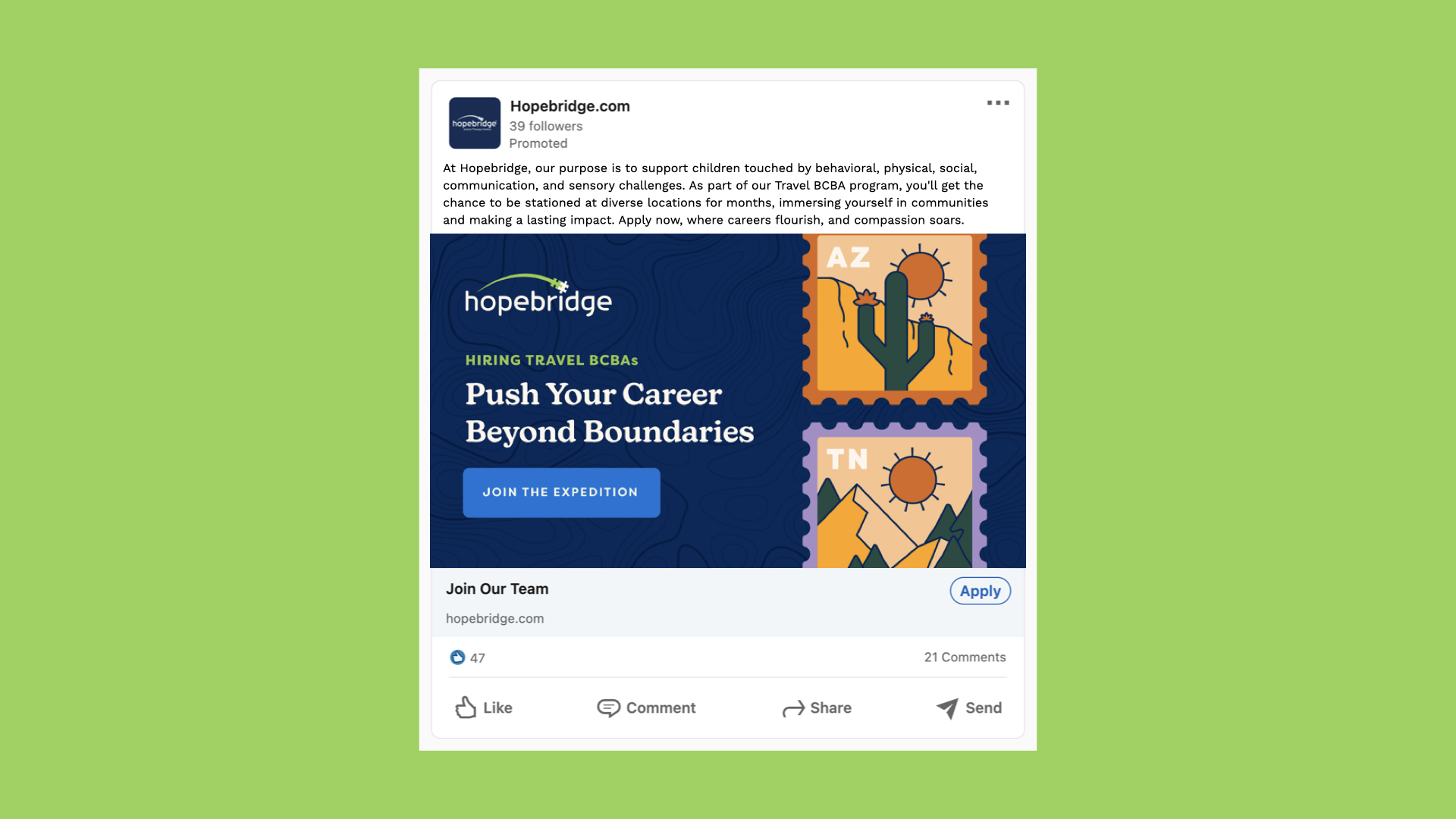
Our Parent Brand elements are to be used on all evergreen Hopebridge applications. This includes our website, social posts, ads, and more. Refer to the primary brand to ensure all future sub-brands look and feel related to the parent brand.
Our Primary
Messaging
Mission Statement
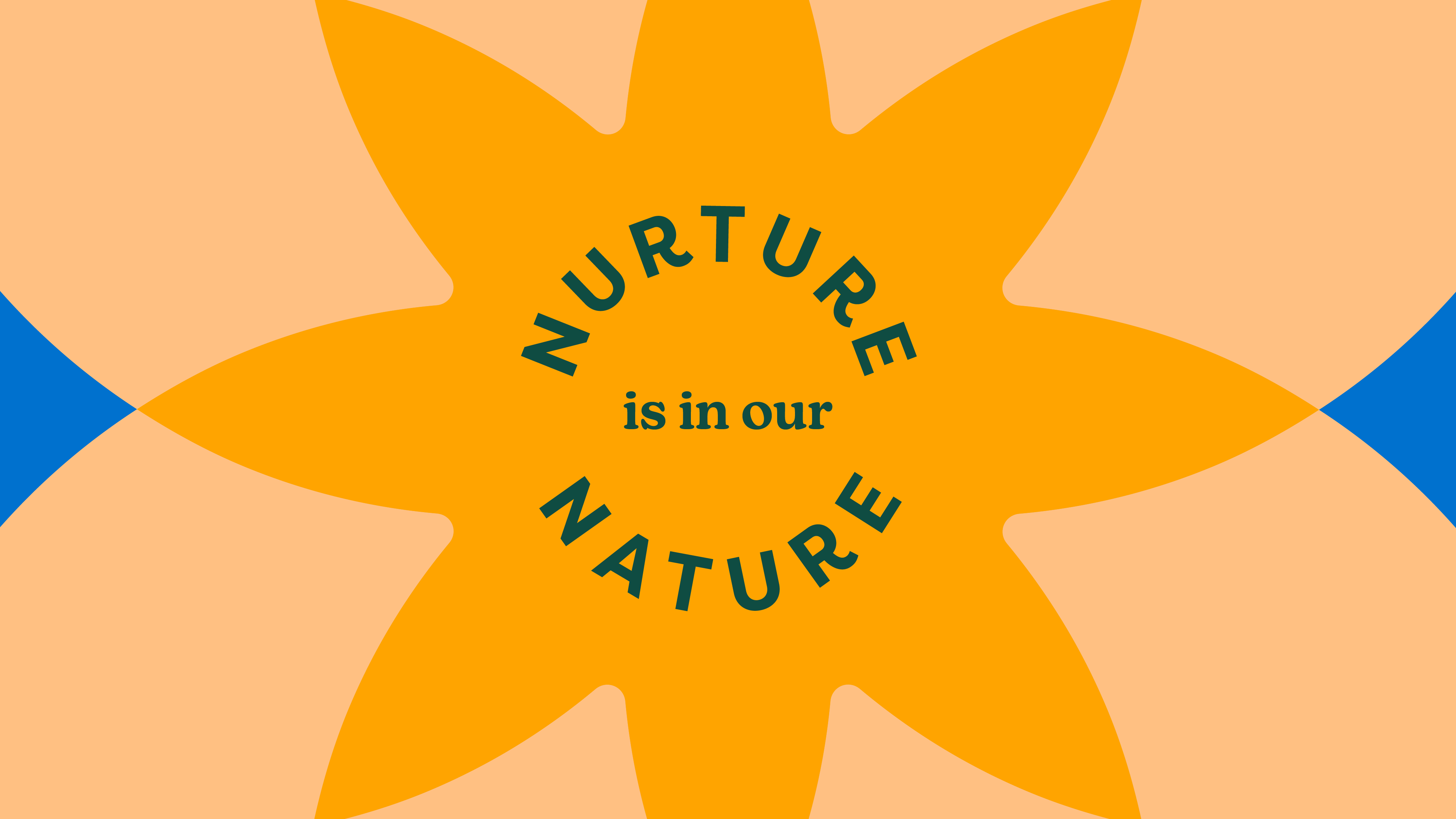
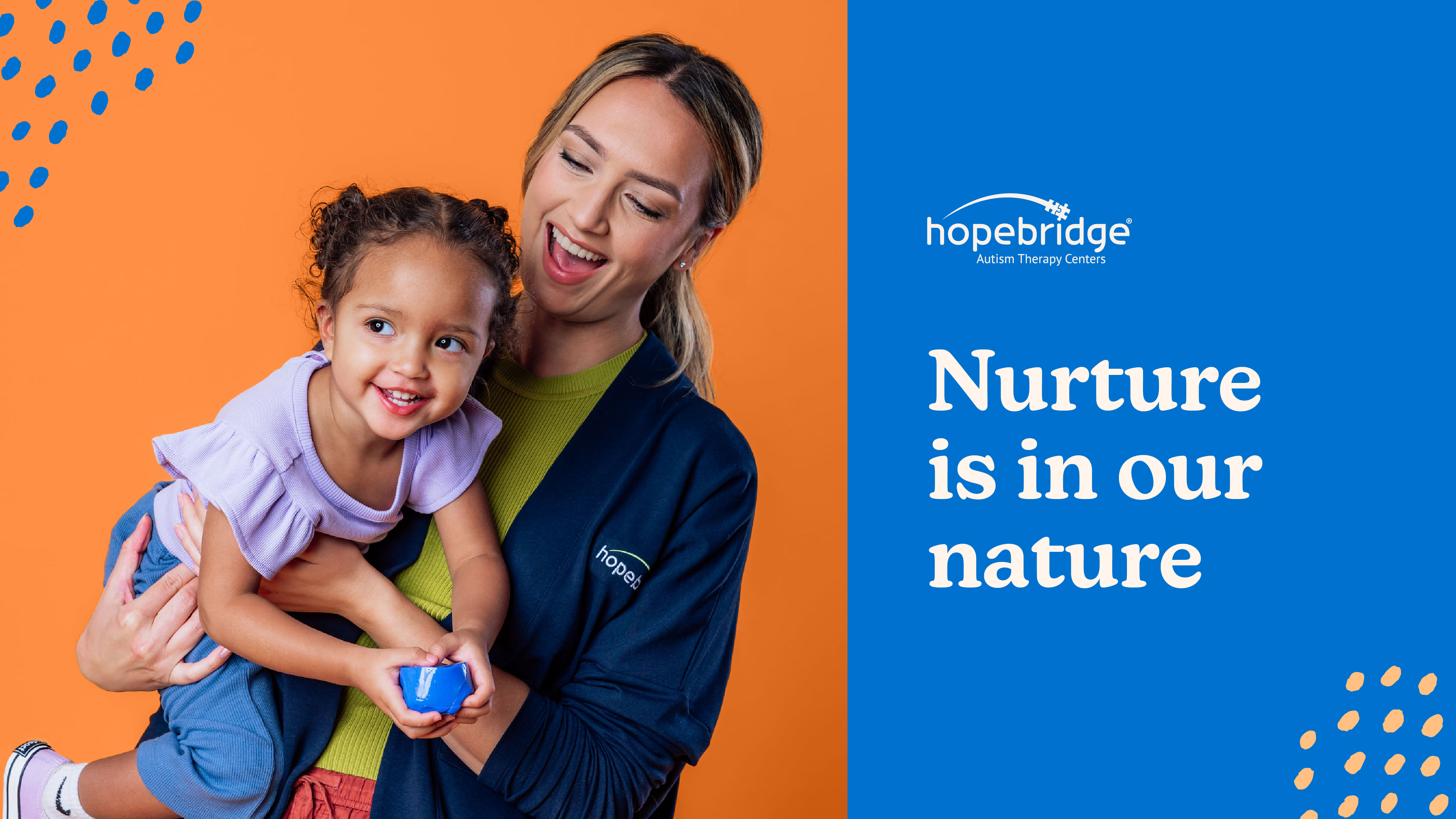
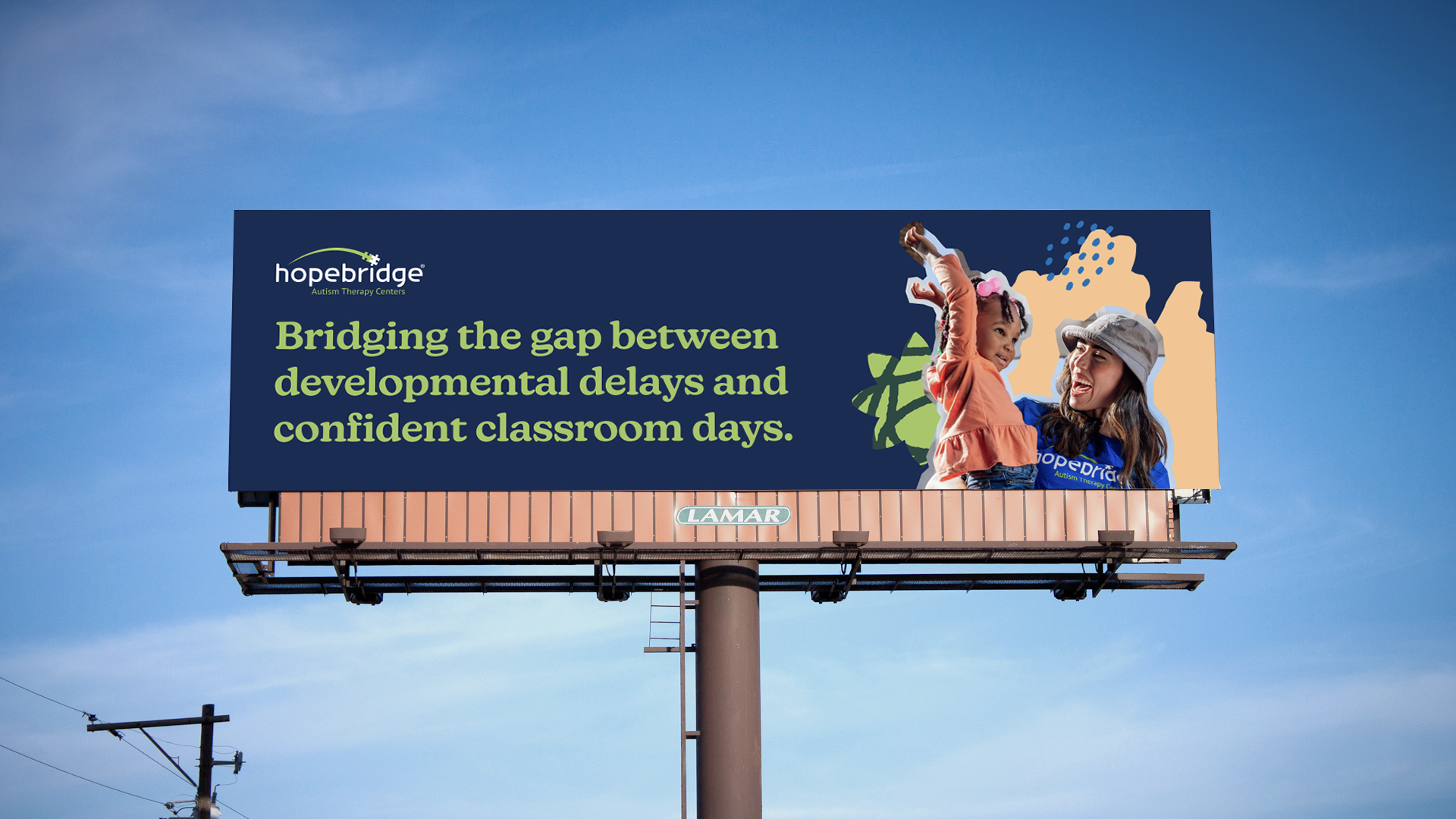
Hopebridge is committed to providing personalized therapy for children and their families touched by behavioral, physical, social, communication, and sensory challenges by building a bridge to access quality, compassionate care.
We are the
Nurturing Ruler
Motto
“Stability isn’t everything; it’s the only thing.”
Gift
Compassion, responsibility, leadership
Motivation
Structure/stability
Goal
Create a prosperous, cared-for family, company, and community
Strategy
Exert leadership
Challenge
Loss of control, chaos; entitled arrogance; authoritative
Why the "Nurturing Ruler"
- While the prevalence of ASD is rapidly growing, Hopebridge provides stability to an otherwise underserved provider space
- Commitment to guiding patients over every obstacle
- Dedication to continuous improvement, both internally and with patients
- Hopebridge is an industry leader in the development of BCBAs and RBTs
- Hopebridge gives children the care & support they need to flourish: “95% of caregivers stated their child is still attending school after attending Hopebridge”
Our
Values
Value Proposition
Live your best life.
Hopebridge is where families find help and hope as children with autism learn to unlock their full potential with support from the highest quality, convenient, and compassionate care. Just as we do for our children, we live for the daily “wow” moments in the lives of our Hopebridge Heroes, offering a supportive, collaborative environment with limitless opportunities to grow their careers.
How our values translate to our
Brand Voice
Be Passionate
Enthusiastic
Be Awesome
Empowering
Learn & Grow
Educational
Give Hope
Inspiring
Contribute to the Team
Collaborative
Brand Messaging Reference
Don’t overuse “hope”.
“Hope” is already part of our name, so we should avoid overusing it in messaging. Words like “longing,” “potential,” “future,” “dream,” and “belief” can be helpful substitutes. Avoid words like “desire,” “wish,” or “longing,” as they may have other inappropriate connotations and do not communicate the idea of hope as accurately as other options may.
Bring the message back to “the why.”
Whether directing the message to families, potential or current employees, or partners, it’s important to remind the audience why we are doing this. Using language like “passion,” “opportunity,” “commitment,” “meaningful,” and “inspirational” can help tell the story and emphasize the significance of what we can do together.
Focus on positive themes.
Rather than solely discussing what kids “can’t do,” aim to turn the message around by citing the new possibilities and opportunities that will open for them at Hopebridge.
Keep first paragraphs short and energetic.
These should feel like an “invitation to read” for the audience. Let subsequent paragraphs do the heavy informational lifting, if needed. But even then, brevity keeps readers engaged.
Headlines should be short and informative.
People frequently jump around on a page to read what interests them the most. Headlines act as shorthand, telling them what’s to come in the message below.
Testimonials are powerful.
Readers always have a level of skepticism, but testimonials disarm any hesitancy and make our successes real. Even better? Deliver testimonials in video form.
Personalize the messaging.
Rather than saying “children” or “families” in copy, directly address the reader with phrases like “your child,” “your family,” or “your future” when it makes sense.
Please note: This personalization is not allowed on some social media platforms. Check the regulations of each platform for more specific direction.
Get a second set of eyes on your copy or messaging.
Your first draft will frequently be longer or not as clear as possible. An outside review will make your communications shorter and easier to understand.
Use inviting, encouraging, and differentiating words
when communicating to prospective team members.
For Example
“Joining our team will give you a good life”
“Hopebridge offers the promise of a better life with a dynamic team and personal and professional growth and achievement”
Preferred
Language & Grammar
Hopebridge is committed to using inclusive language. This list is subject to change as the autism space evolves.
Don't Say
Do Say
"Autism"
"autism"
“Applied behavioral analysis”
“Applied behavior analysis”
“BAF” or “Behavior Analyst Fellowship”
“Fellowship program for behavior analysis”
“Staff” or “Employees”
“Team members”
“Clinic,” “Facility,” “School,”
“Center”
“Guardian,” “Mom,” “Dad,” “Parent”
“Caregiver”
“DTT” or “direct trial training”
“Table time,” “Focused instruction,” or “One-on-one learning”
“Sales,” “Marketing,” or “Business development”
“Community,” “Relationships,” or “Outreach”
“Non-verbal”
“Non-speaking”
How to
Refer to Our Patients
We typically begin with people-first language when referencing someone diagnosed with autism because we believe the individual is more than their disability or disorder.
That being said, some self-advocates prefer identity-first language, so open dialogue is key. Each individual has their own identity preferences, so it’s a good idea to ask how they wish to be addressed, rather than assume. We may not be able to learn a young child’s preference, but when possible, we can ask caregivers for their preferences and mirror their language.
Don't Say
Do Say
“Patients” or “Clients”
“Children,” “Kiddos,” and “Kids”
“autistic child”
“Child with autism”
The core of our brand
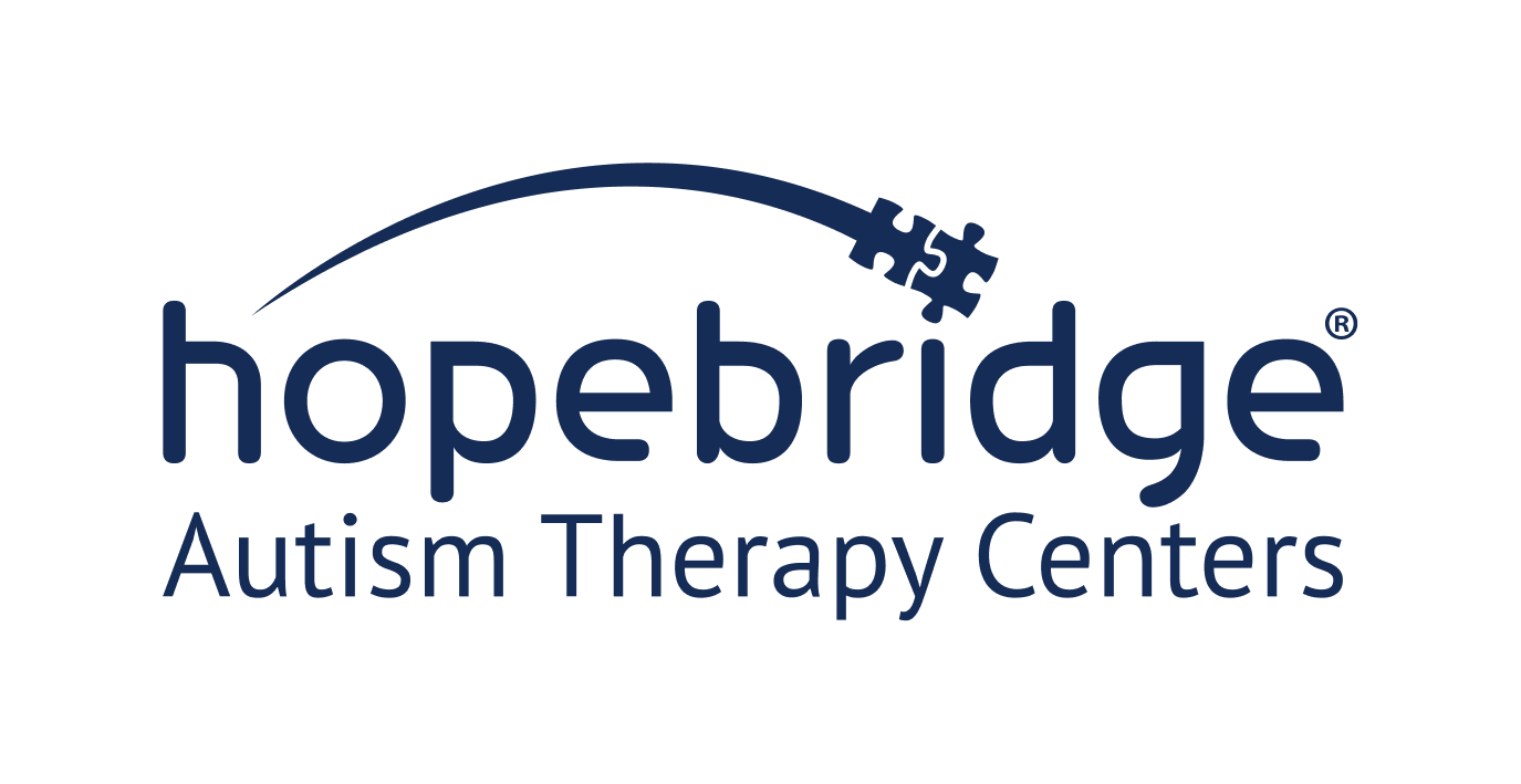
Our Logo Suite
Combo Blue Green
Combo White Green
Combo Navy
Combo White
Combo True Black
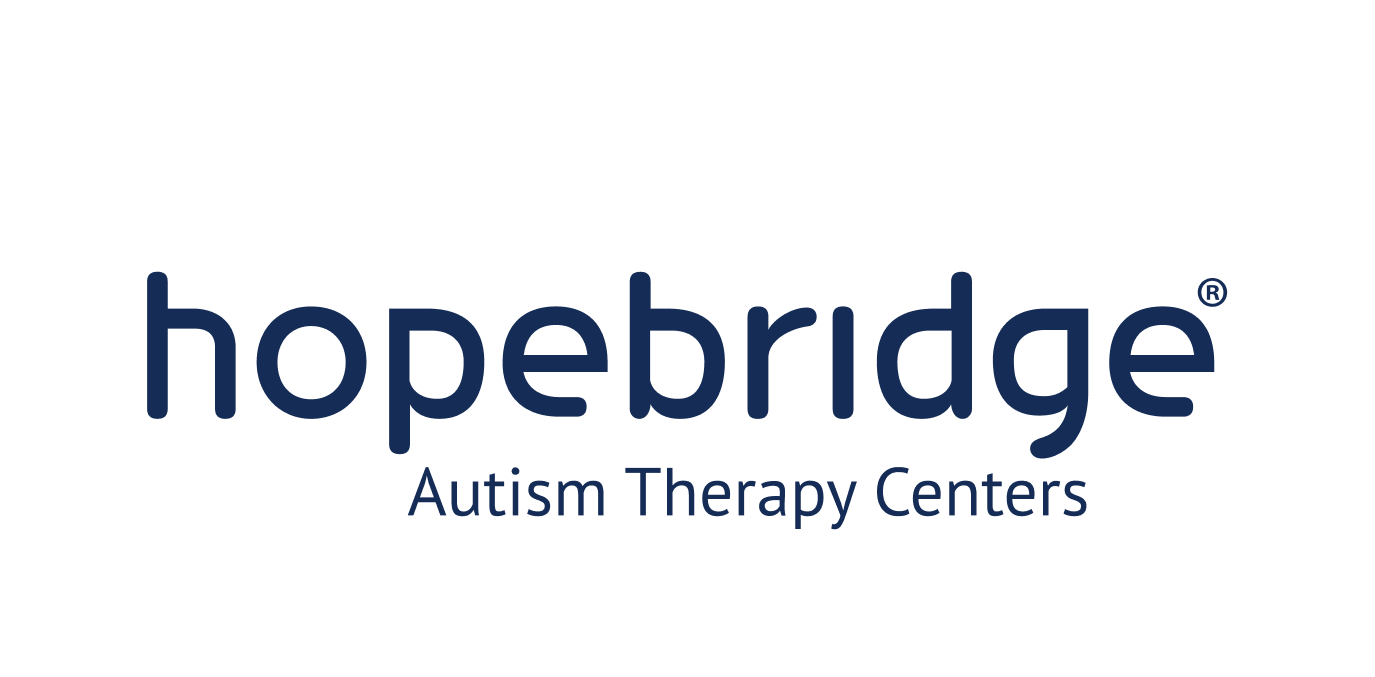
Word Mark
The bridge is ideal in a duotone colorway but may also be used in a single color. This may be necessary on smaller premium items or if two-color printing is cost prohibitive. Use caution when reproducing in a single color because the puzzle pieces appear to merge when drastically reduced.
The full Word Mark should be on all official collateral when size does not allow for the tagline to be included. Only set it in the following approved colorways. The Black colorway is only to be used on brand partnership collateral when required by brand partners.
Word Mark Blue Green
Word Mark White Green
Word Mark Navy
Word Mark White
Word Mark True Black
our logo
Usage
Safe Space
To showcase the logo to its best advantage, it is imperative to allow adequate white—or clear—space around the logo and tagline. This space should be free of text or imagery. The example shown illustrates the minimum amount of clear space around the logo and is measured by the height of the letter form “h.” That said, there will most certainly be instances in which more clearance will be visually desirable.
*Of course, there are exceptions: subtle patterns or textures overlapping at 20% opacity or less are acceptable.
Please Don't
Use unapproved color combinations or colors
Distort the logo and elements
Place logo on backgrounds that make elements hard to read
Utilize the logo on colors with low contrast
Remove the bridge from the logo
Alter the proportion, size, or position of elements
Hopebridge in
Color
Primary Colors
Lively Lime
- Hex #a1c75e
- RGB 161, 199, 94
- CMYK 41, 4, 82, 0
- Pantone 2289 C
Bridging Blue
- Hex #0272ba
- RGB 2, 114, 186
- CMYK 88, 52, 0, 0
- Pantone 285 C 1
Nurturing Navy
- Hex #152c56
- RGB 21, 44, 86
- CMYK 100, 87, 35, 35
- Pantone 295 C
Caring Cream
- Hex #fff5ed
- RGB 255, 245, 237
- CMYK 0, 3, 5, 0
- Pantone P 30-1 C @ 30%
Secondary Colors
Our Secondary Colors are primarily used for background colors on key graphics and to highlight key information such as subheaders.
Grounded Green
- Hex #244a42
- RGB 36, 74, 66
- CMYK 82, 50, 66, 44
- Pantone 561 C
Guiding Green
- Hex #568f3f
- RGB 86, 143, 63
- CMYK 71, 23, 100, 8
- Pantone 370 C
Loving Lilac
- Hex #a68cc7
- RGB 166, 140, 199
- CMYK 36, 47, 0, 0
- Pantone 264 C
Brave Burnt Orange
- Hex #d9691f
- RGB 217, 105, 31
- CMYK 11, 71, 100, 1
- Pantone 158 C
Open Orange
- Hex #ffa300
- RGB 255, 163, 0
- CMYK 0, 42, 100, 0
- Pantone 137 C
Purposeful Peach
- Hex #fac48c
- RGB 250, 196, 140
- CMYK 1, 25, 48, 0
- Pantone 156 C
Our Primary
Font Families
Usage
Use this font suite in all applications across all sub-brands when available.
Subheadings & Buttons - Filson Pro Bold
ABCDEFGHIJKLMNOPQRSTUVWXYZ1234567890!@#$%^&
Headings - New Kansas Semi-Bold
Aa Bb Cc Dd Ee Ff Gg Hh Ii Jj Kk Ll Mm Nn Oo Pp Qq Rr Ss Tt Uu Vv Ww Xx Yy Zz
1234567890!@#$%^&
Body - Filson Pro Book
Aa Bb Cc Dd Ee Ff Gg Hh Ii Jj Kk Ll Mm Nn Oo Pp
Qq Rr Ss Tt Uu Vv Ww Xx Yy Zz 1234567890!@#$%^&
Our Alternative
Font Families
Usage
Use this font suite in all applications across all sub-brands when primary fonts are unavailable, such as Canva.
Headings - ITC Souvenir Semibold
Aa Bb Cc Dd Ee Ff Gg Hh Ii Jj Kk Ll Mm Nn Oo Pp Qq Rr Ss Tt Uu Vv Ww Xx Yy Zz
1234567890!@#$%^&
Body - Figtree Regular
Aa Bb Cc Dd Ee Ff Gg Hh Ii Jj Kk Ll Mm Nn Oo Pp
Qq Rr Ss Tt Uu Vv Ww Xx Yy Zz 1234567890!@#$%^&
Our brand
Photography
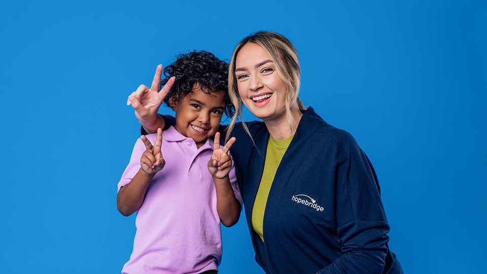
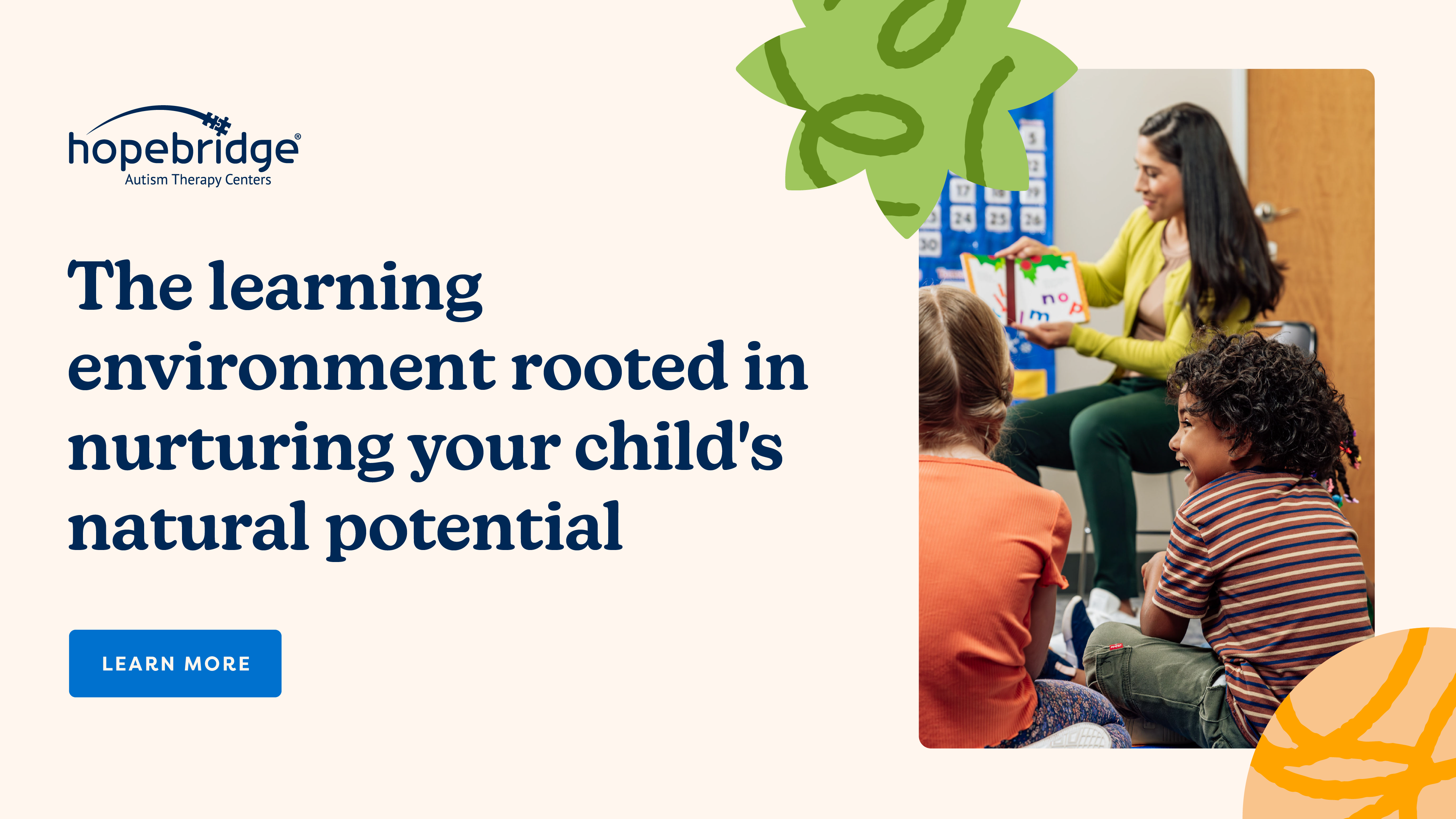
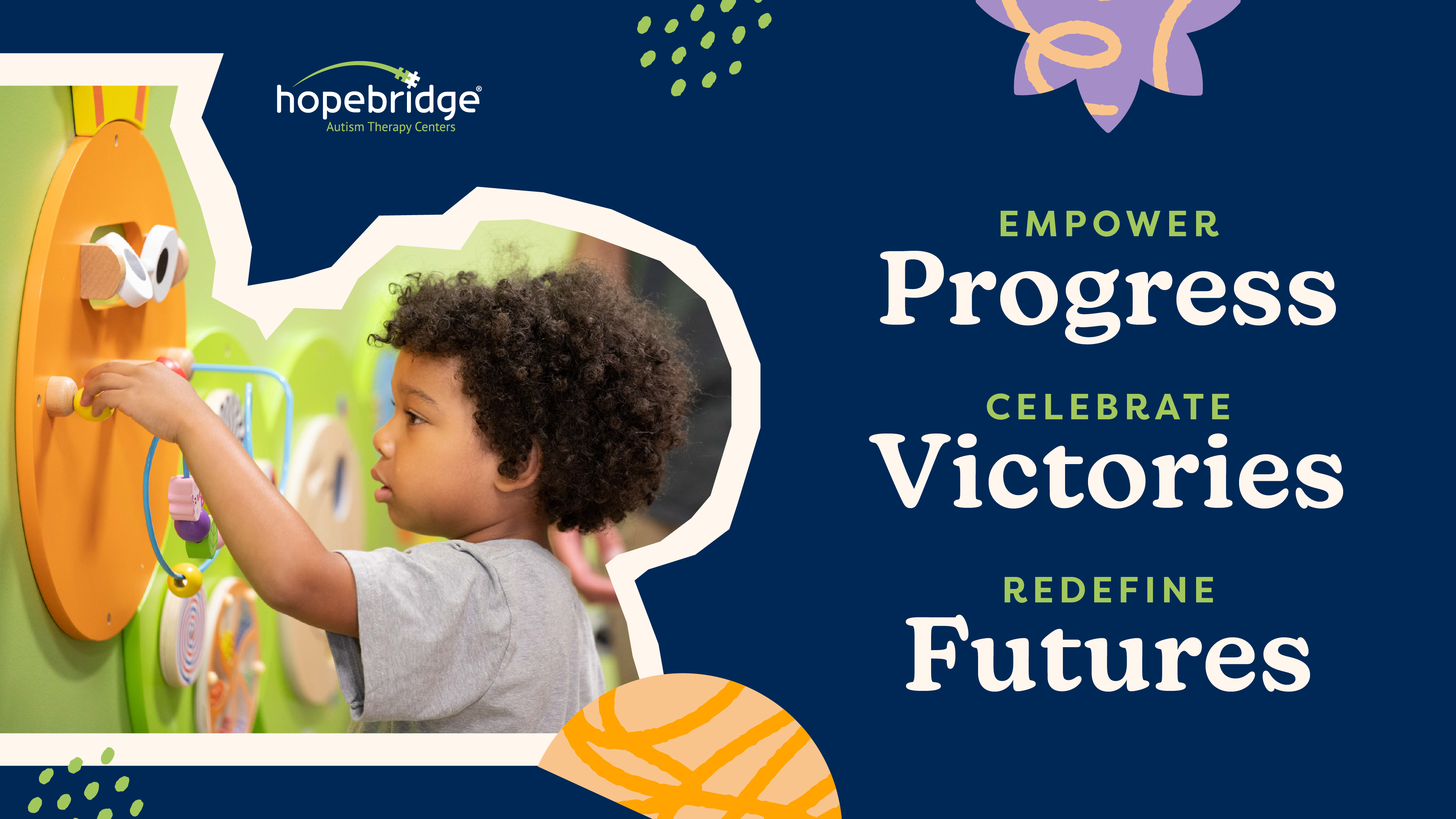
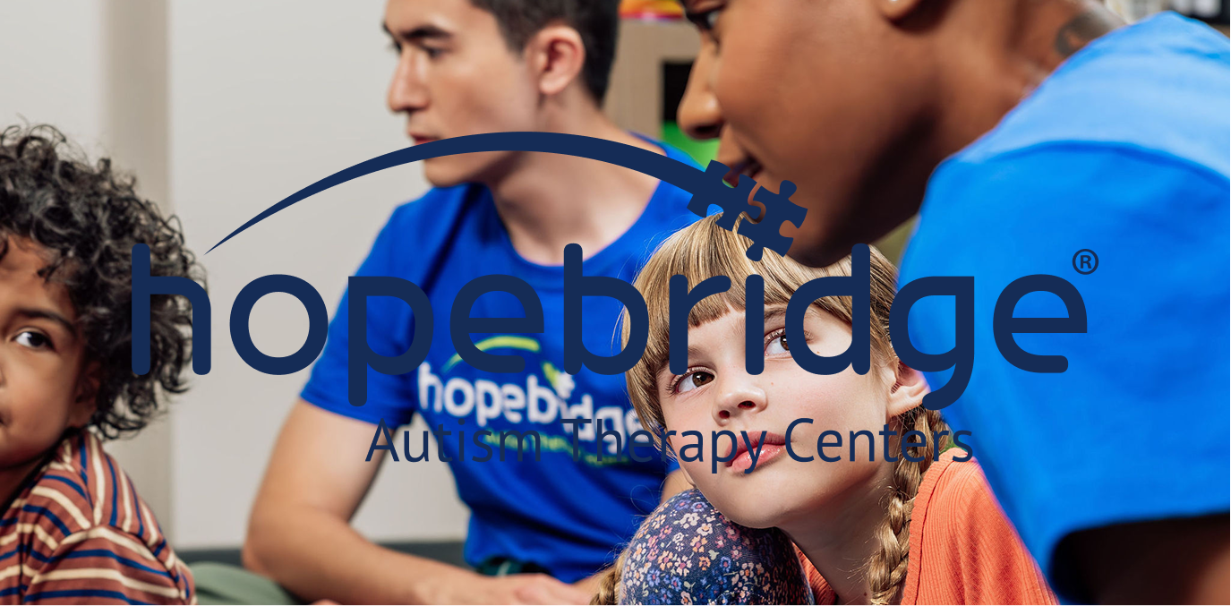
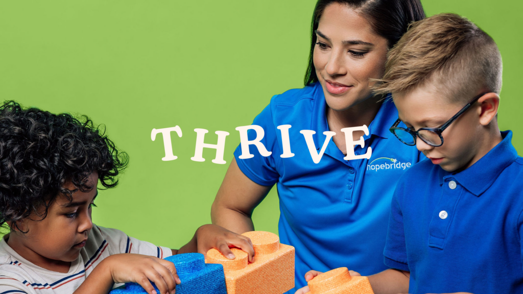
Professional Photography
Bright natural photography represents the reality of working with Hopebridge. Children and employees are shown in action, and the photos are edited to be bright with higher contrast and saturation. Studio photography focuses on the individual pillars of the Hopebridge community: our employees and our children. It shows who they are as individuals with the Hopebridge colors as backdrops.
Use for the majority of paid media and collateral.
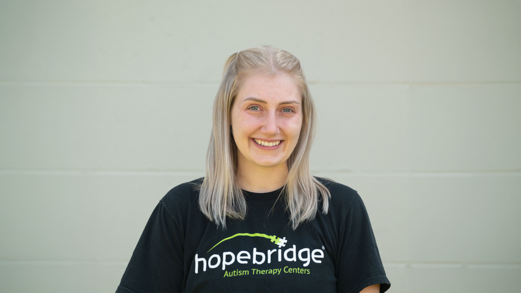
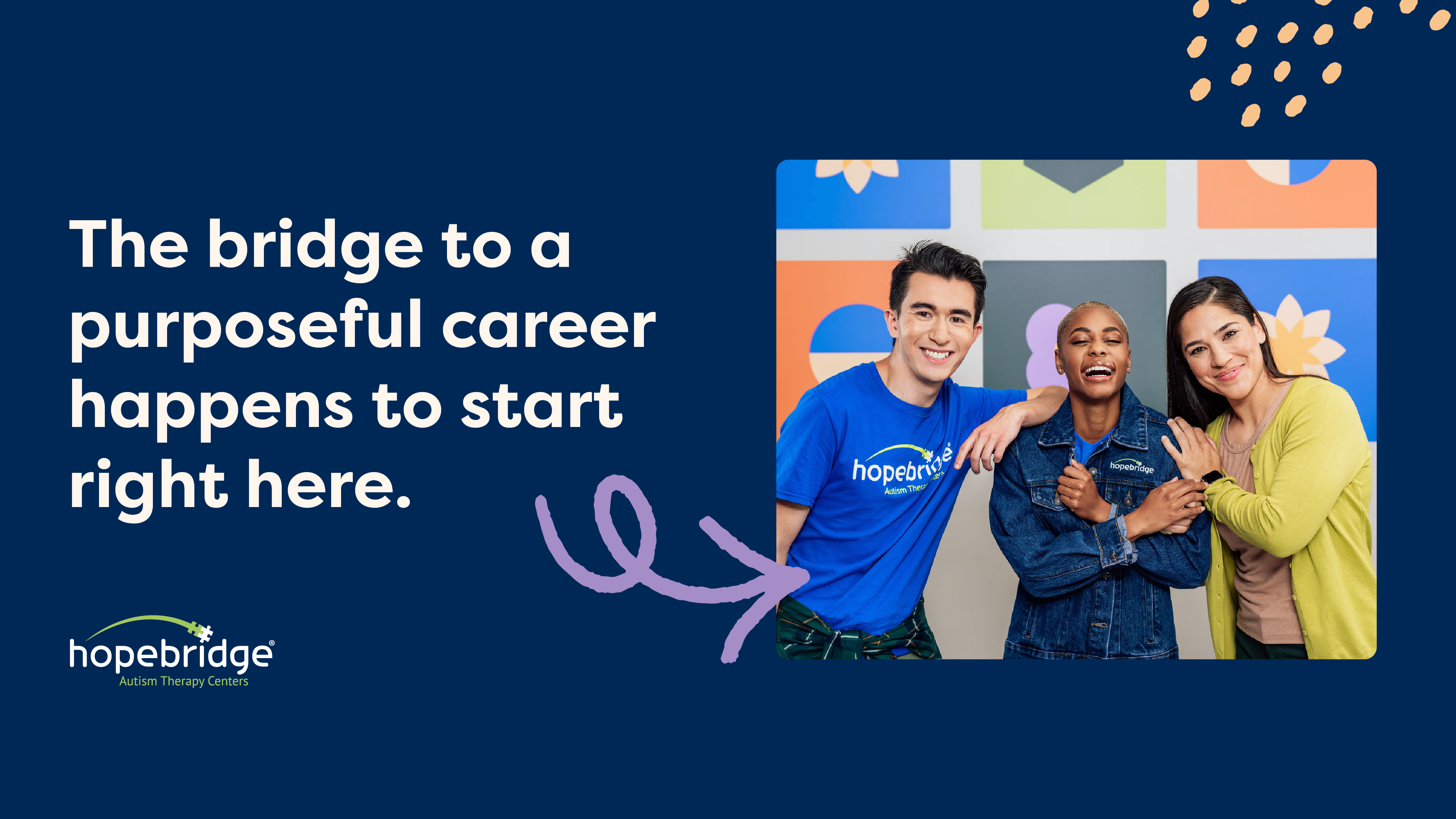
UGC Photography
This photography is more casual, authentic, and represents the day-to-day of our centers and people.
Use for social posts and in placements anchored in authenticity.
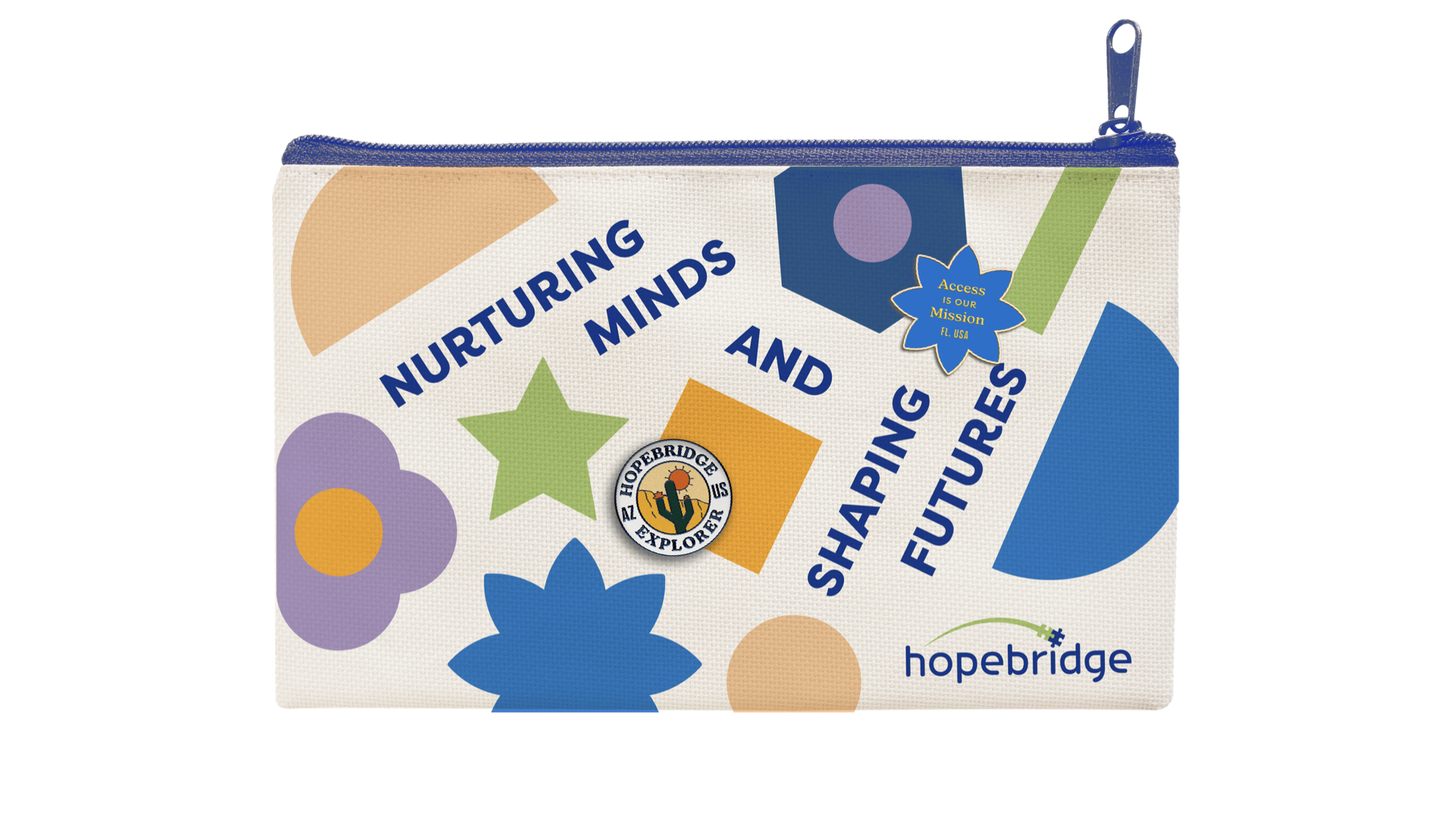
depth through
Design Elements
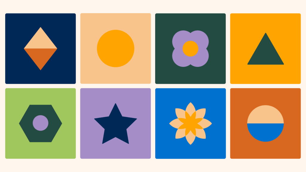
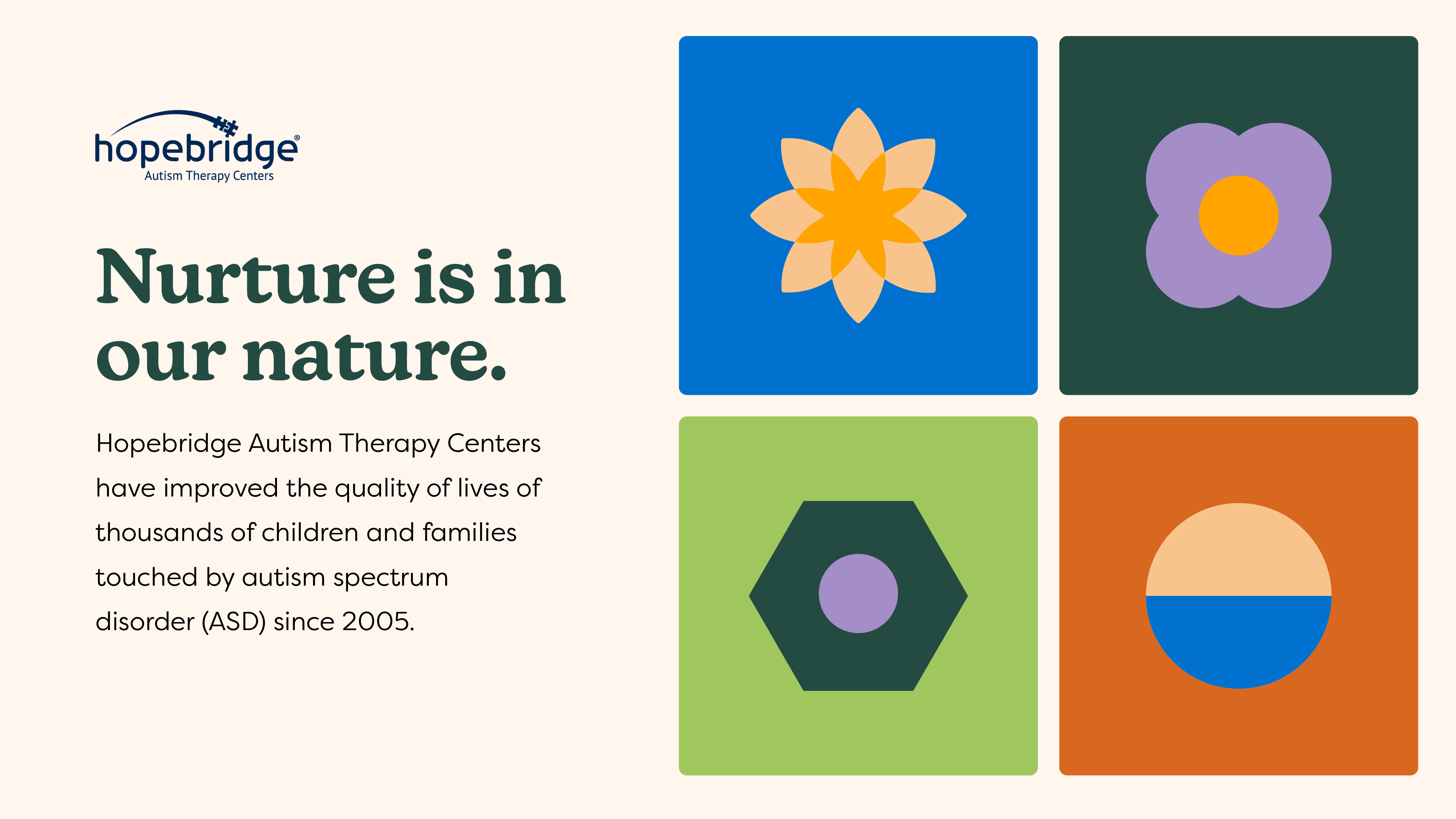
Geometric Shapes
Structured geometric shapes represent developmental games and provide an element of structure to the brand. They serve to communicate to both the children Hopebridge serves and the greater autism community as Hopebridge stands for stability in an otherwise under-served provider space

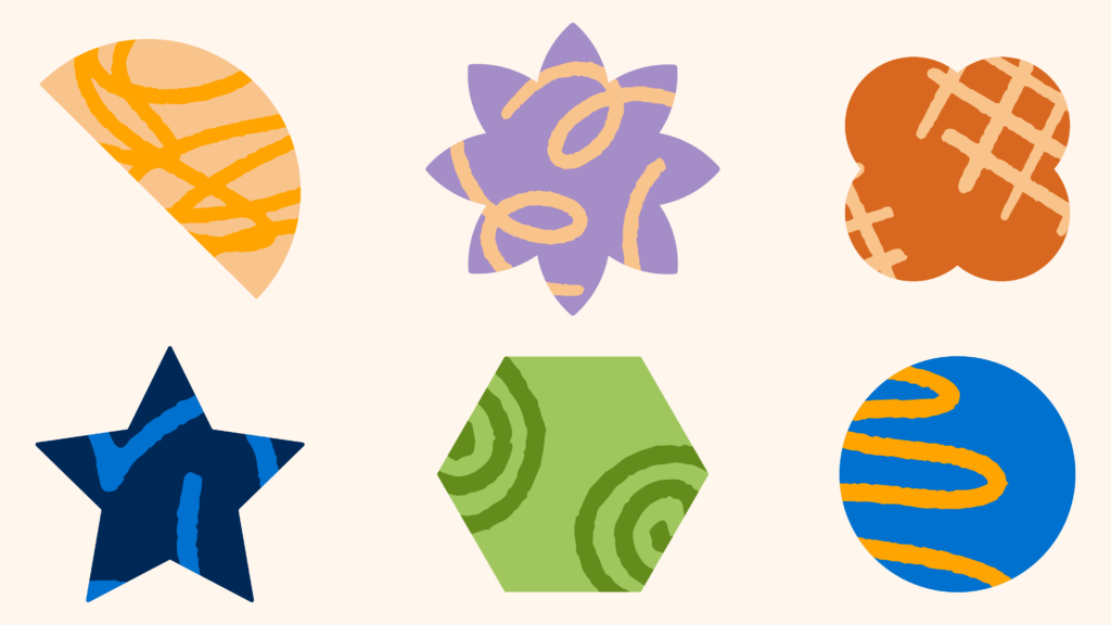
Texture
Organic elements bring inspiration and joy into a sometimes difficult space for caregivers and employees. Balanced with the geometric design elements, the Hopebridge brand acheives enthusiastic sophistication.
Use the elements as is or apply the stroke texture to line elements in key graphics.

Confetti Pattern
We utilized our textured elements to create this joyful pattern to pay homage to the little victories that make a big impact in the lives of the families we serve.
Use the pattern as is or apply the stroke texture to line elements in key graphics.
Scribbles in Shapes
Textured and organic elements paired with playful shapes bring variety and vibrancy into the brand.
Kinetic Text
Typography also serves as a design element when used in inspired ways. Hopebridge leads with passion in every sense, even typography.
Brand in action
Application